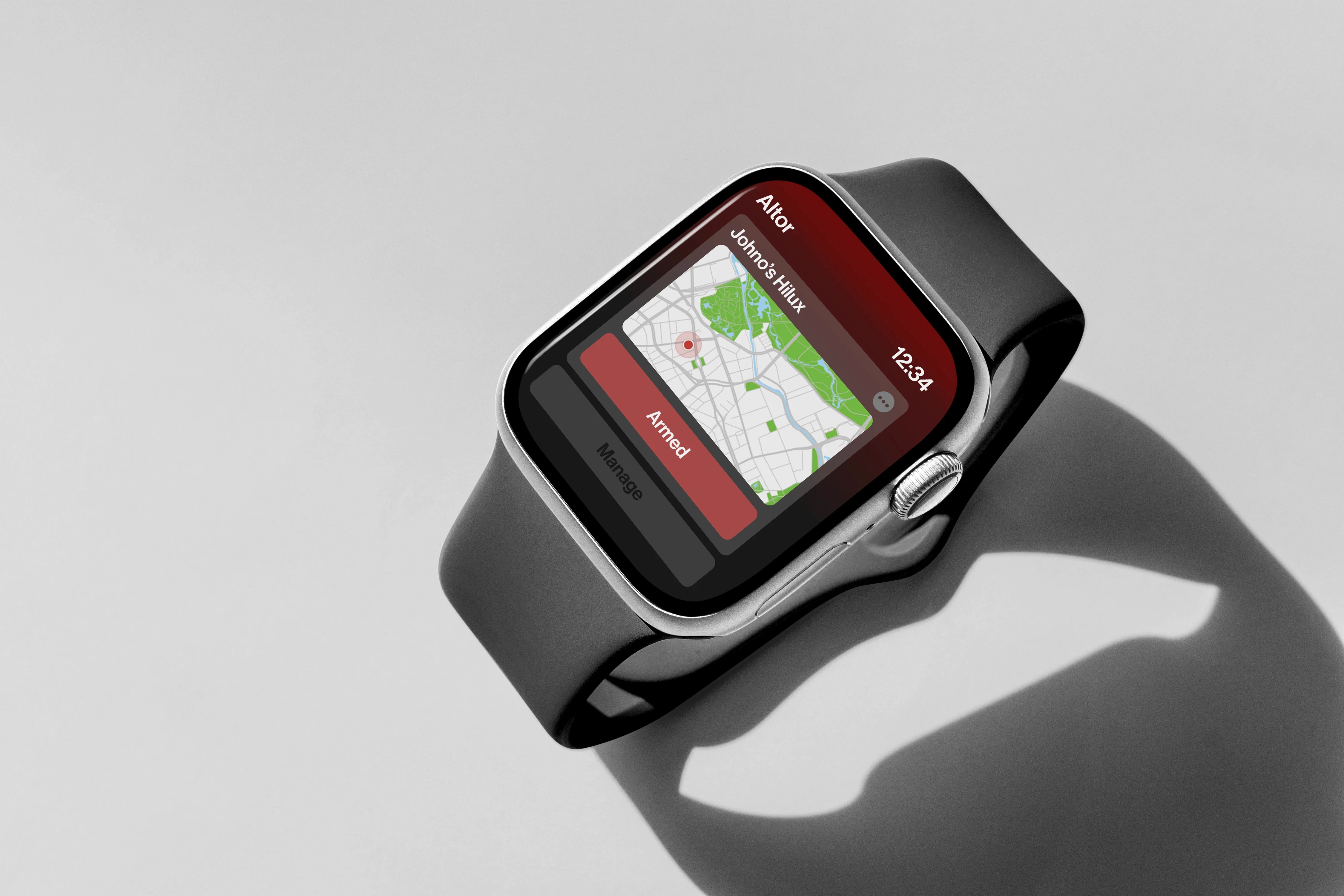
Altor Security
12-Weeks | Built in Figma
Industry Project | UX Research | Stakeholder Manegement
The Problem
As part of my capstone project at Swinburne University, my team and I collaborated with AltorTech, a security startup loctated in Melbourne’s East. The folks at Altor wanted us to redesign their existing mobile application, giving it a much needed glow-up, turning their pumpkin of an app into a beautiful golden carriage.
Challenges
Ever tried using your phone with dirty hands?
…Now imagine you’re a tradie on a job site, trying to deactivate a false-alarm for an aftermarket security system you had installed on your ute. That’s exactly the kind of challenge we faced designing Altor’s app. Our research uncovered a simple truth: tradies are impatient. They do not have the time for a clunky, slow, and unintuitive interface; as one of our interviewee’s put it, they have “sh*t to do.”
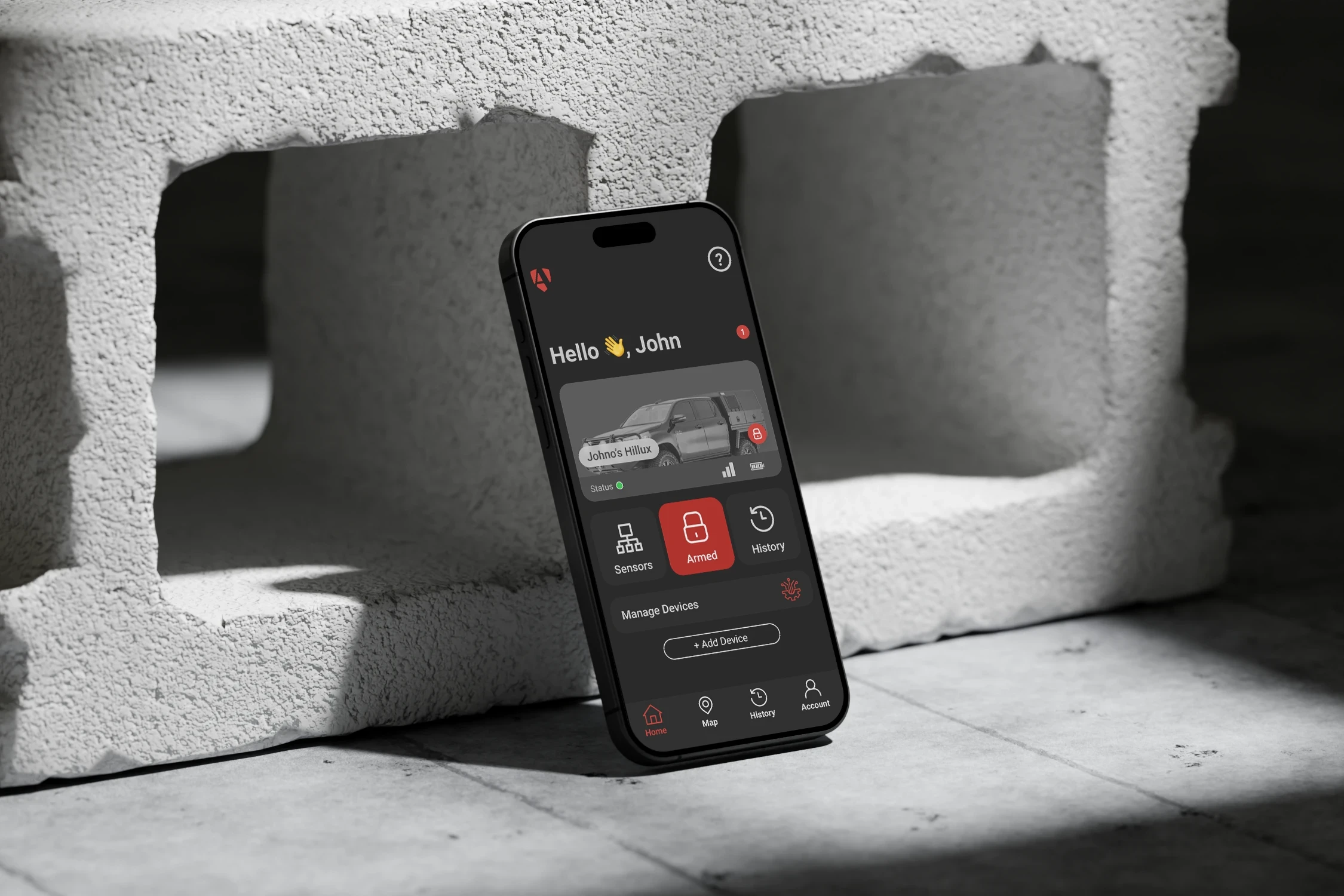
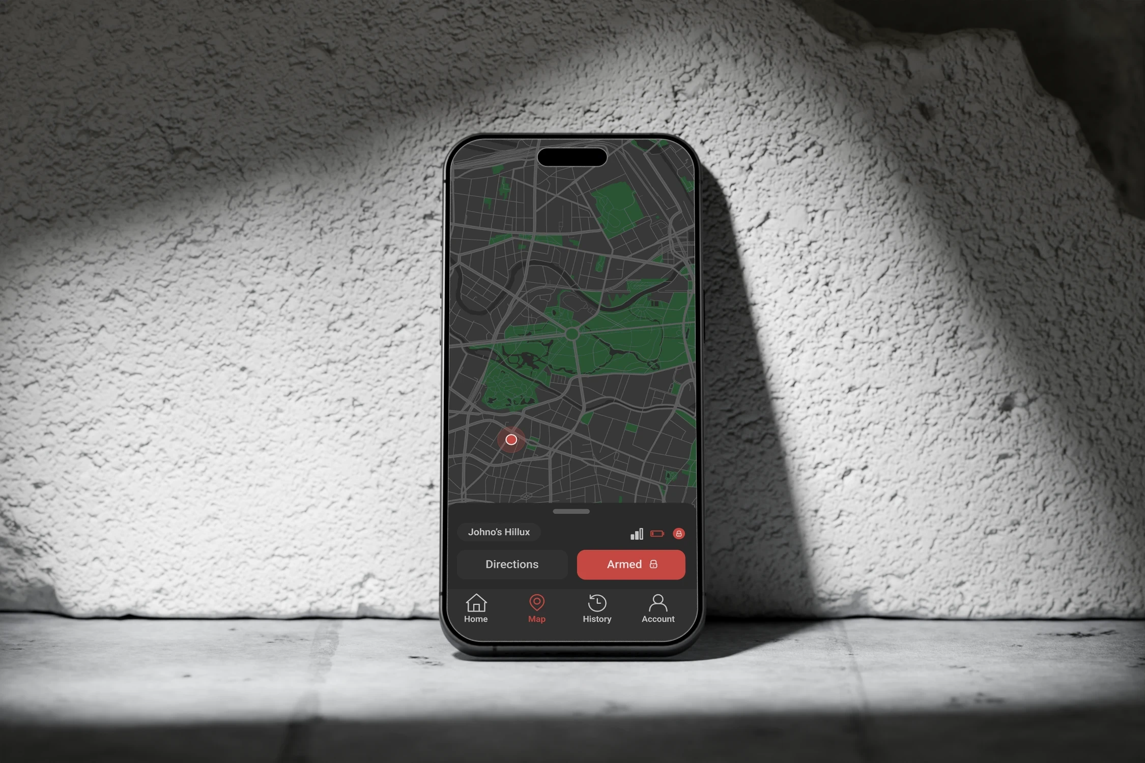
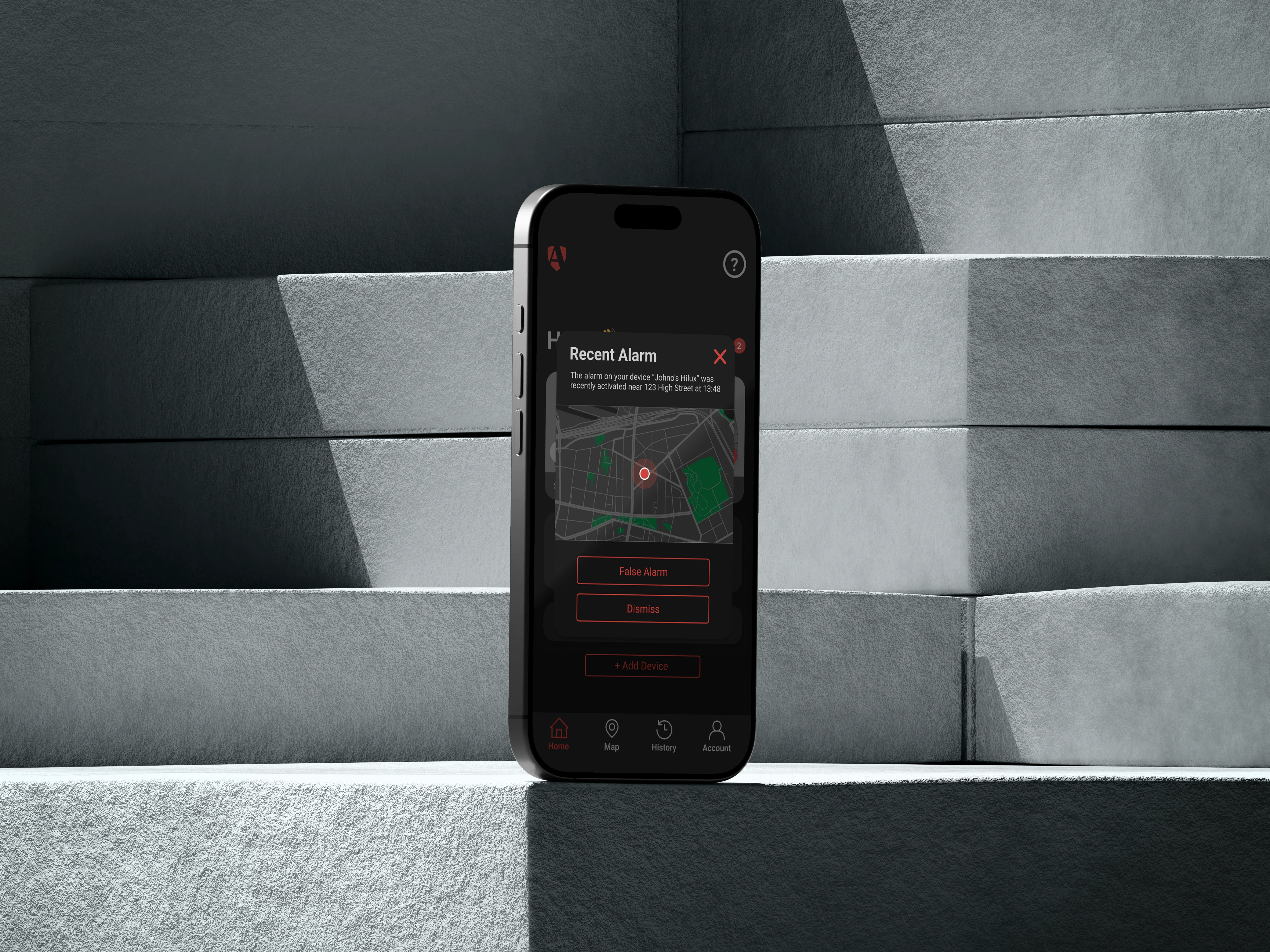
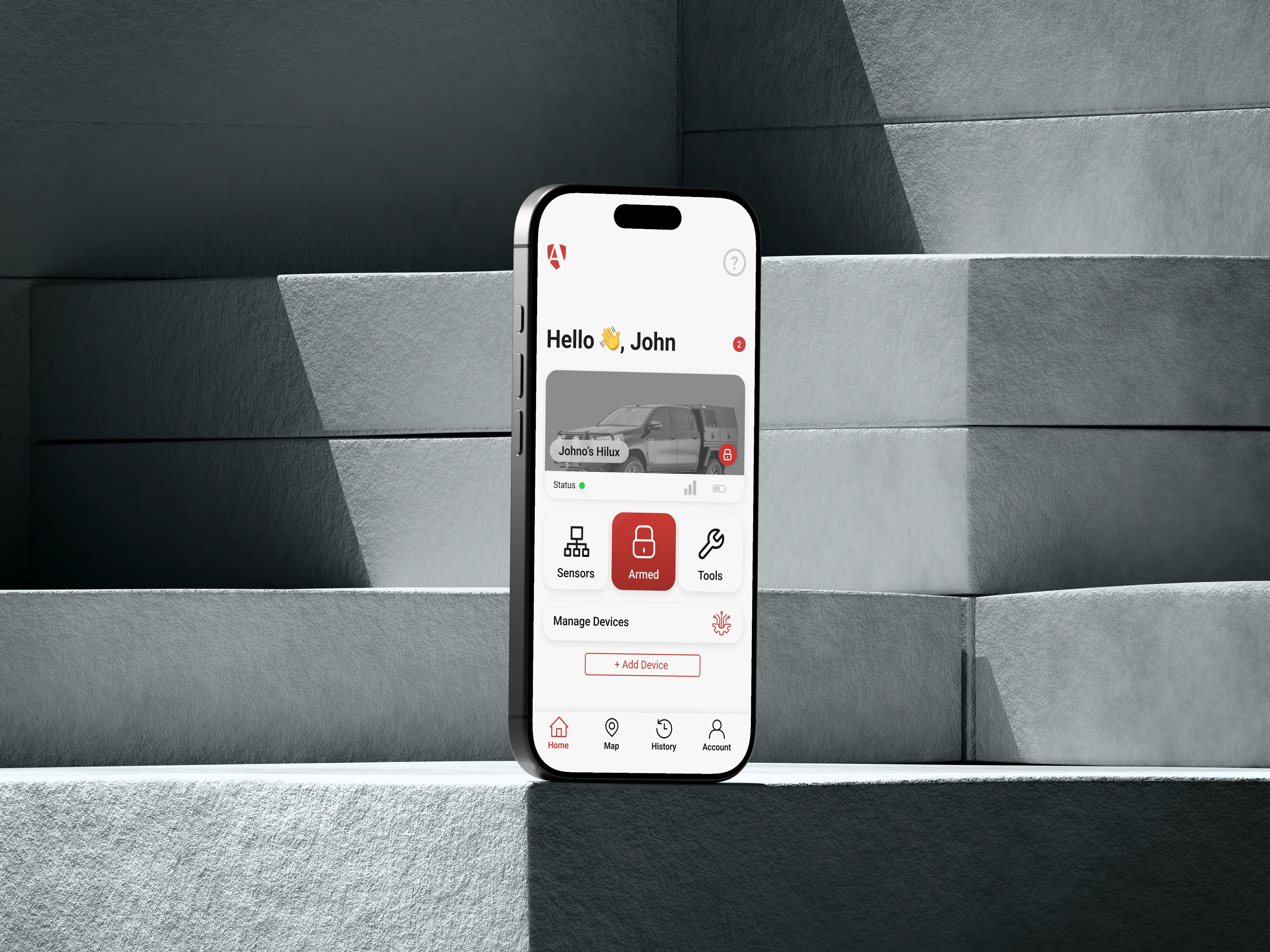
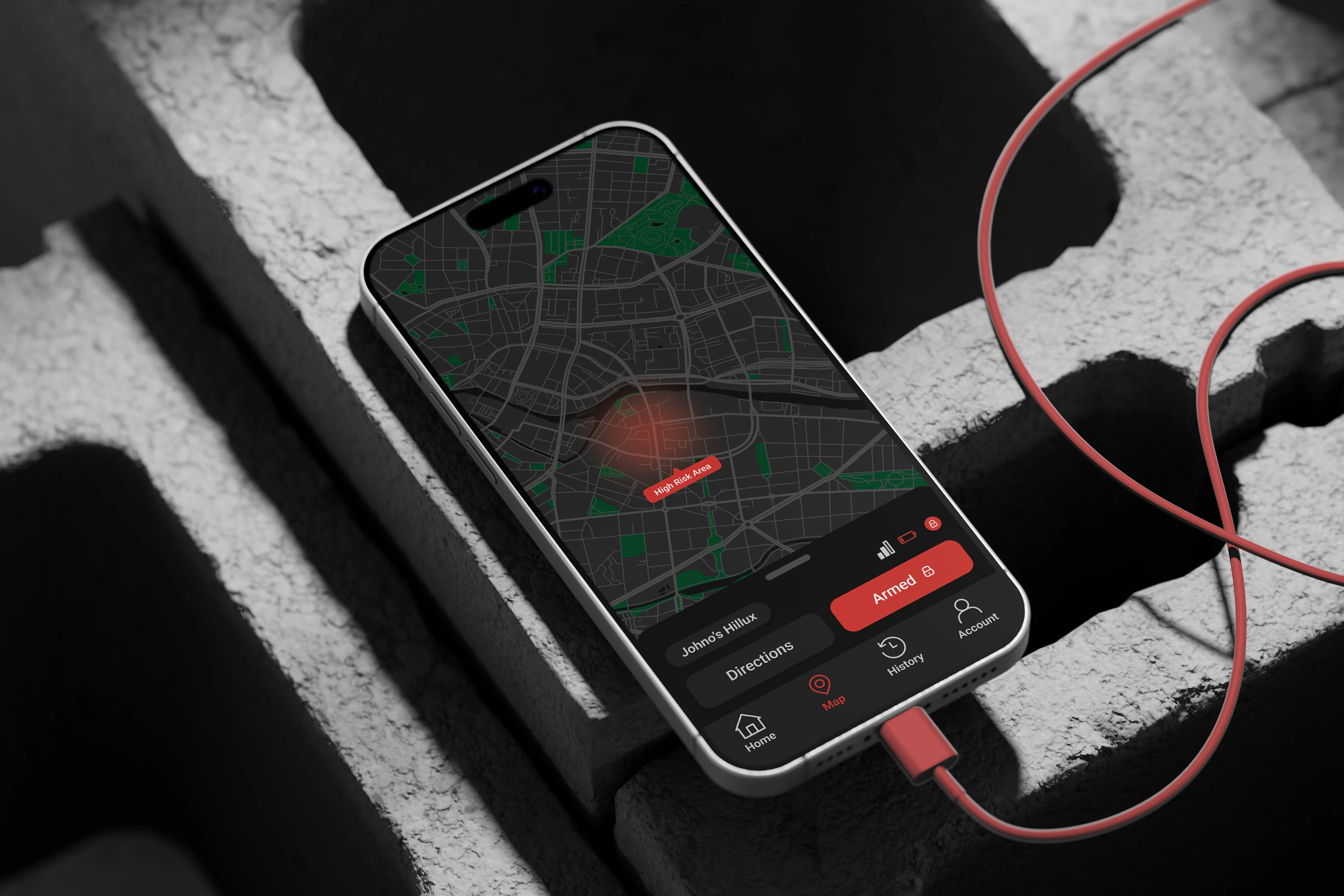
To address this key finding we took the current app to the chopping block and reworked the entire interaction flow — fewer taps, larger touch targets, and a UI that is functional in harsh sunlight and low-light conditions.
"Make it look techy"
What does “techy” really mean? Is it the clean minimalism of Apple and Helvetica, or the edgy, matte-black aesthetic of a gaming headset? Early on, the brief left a lot open to interpretation — which posed both a challenge and an opportunity. With limited initial direction, we approached the project with flexibility and curiosity, testing multiple visual directions and refining the design through a series of iterations. After plenty of back-and-forth, we landed on a prototype the clients were genuinely excited about.
Just because it can, doesn't mean it should.
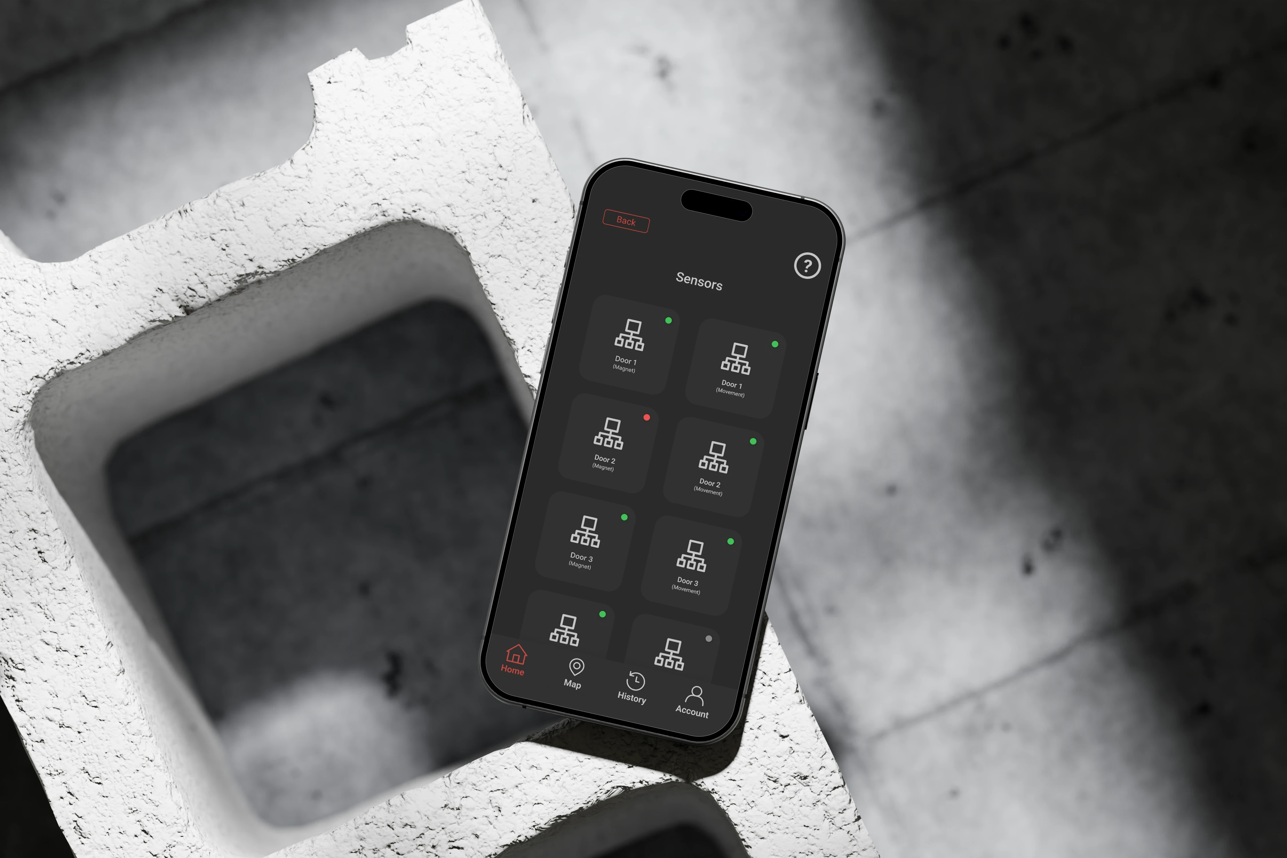
The product that AltorTech have designed was built with a vast array of sensor technology, which actively collect all sorts of raw data. During early iterations of our prototype, we explored various interfaces, in various styles, that displayed the raw sensor readings— this was under the assumption that more information meant better control.
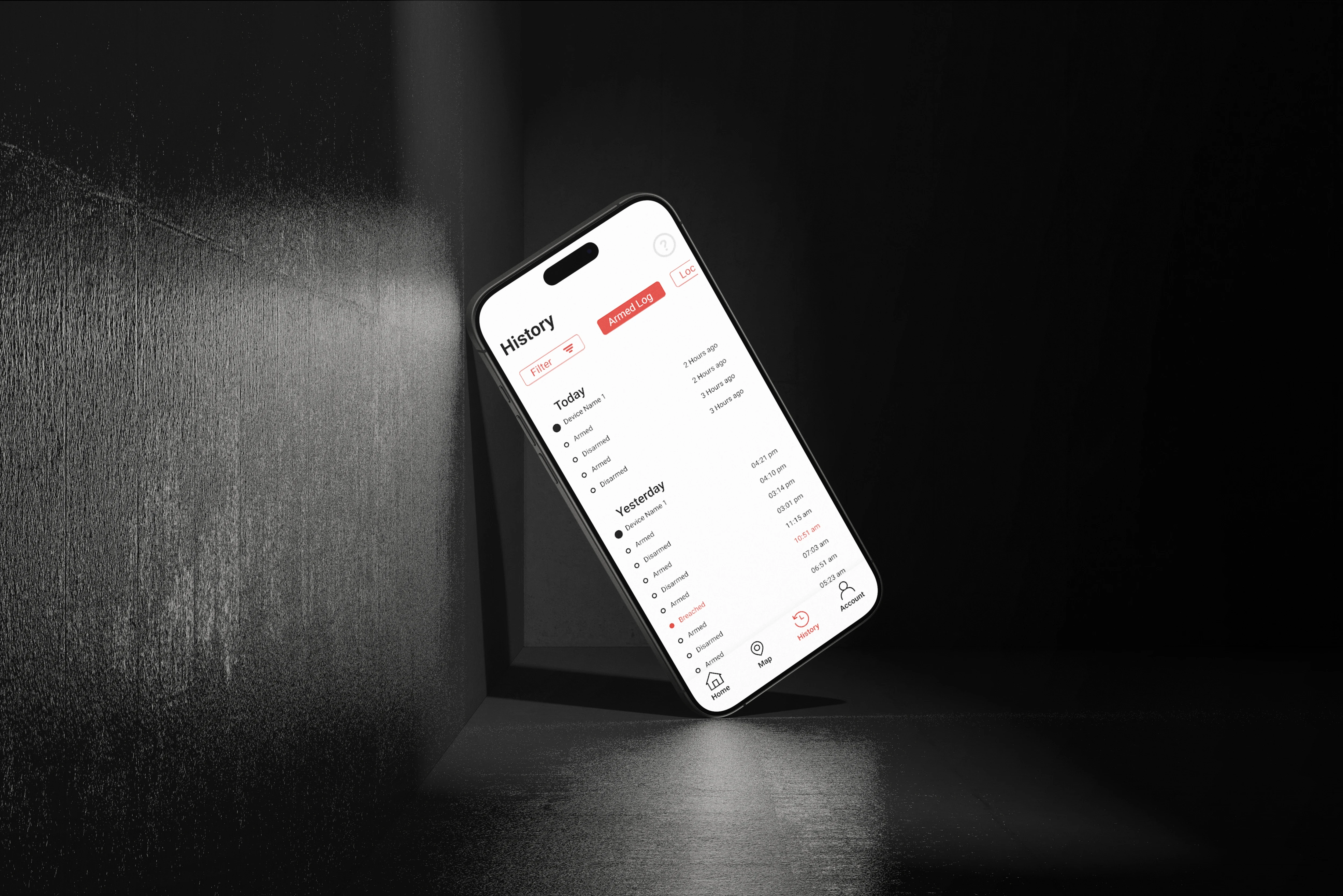
However, through user-testing we learned the opposite: too much data overwhelms the user, slowing decision making and distracting from the more important features. We stripped away unnecessary noise to ensure that when something did demand attention, it wasn't lost in a sea of numbers.

Next Project:
Pages & Pathways

Next Project:
Pages & Pathways
A mobile game that takes players around Melbourne on a grand adventure. It also looks pretty cool.
Ready to make
something great?
Fill out the form to unlock the full potential of your business…
Altor Security
12-Weeks | Built in Figma
Industry Project | UX Research | Stakeholder Manegement
The Problem
As part of my capstone project at Swinburne University, my team and I collaborated with AltorTech, a security startup loctated in Melbourne’s East. The folks at Altor wanted us to redesign their existing mobile application, giving it a much needed glow-up, turning their pumpkin of an app into a beautiful golden carriage.
Challenges
Ever tried using your phone with dirty hands?
…Now imagine you’re a tradie on a job site, trying to deactivate a false-alarm for an aftermarket security system you had installed on your ute. That’s exactly the kind of challenge we faced designing Altor’s app. Our research uncovered a simple truth: tradies are impatient. They do not have the time for a clunky, slow, and unintuitive interface; as one of our interviewee’s put it, they have “sh*t to do.”
To address this key finding we took the current app to the chopping block and reworked the entire interaction flow — fewer taps, larger touch targets, and a UI that is functional in harsh sunlight and low-light conditions.
"Make it look techy"
What does “techy” really mean? Is it the clean minimalism of Apple and Helvetica, or the edgy, matte-black aesthetic of a gaming headset? Early on, the brief left a lot open to interpretation — which posed both a challenge and an opportunity. With limited initial direction, we approached the project with flexibility and curiosity, testing multiple visual directions and refining the design through a series of iterations. After plenty of back-and-forth, we landed on a prototype the clients were genuinely excited about.
Just because it can, doesn't mean it should.
The product that AltorTech have designed was built with a vast array of sensor technology, which actively collect all sorts of raw data. During early iterations of our prototype, we explored various interfaces, in various styles, that displayed the raw sensor readings— this was under the assumption that more information meant better control.
However, through user-testing we learned the opposite: too much data overwhelms the user, slowing decision making and distracting from the more important features. We stripped away unnecessary noise to ensure that when something did demand attention, it wasn't lost in a sea of numbers.
Next Project:
Pages & Pathways
Next Project:
Pages & Pathways
A mobile game that takes players around Melbourne on a grand adventure. It also looks pretty cool.
Ready to make something great?
Fill out the form to unlock the full potential of your business…