
The Idea
This assignment allowed for more creative freedom than others I had done in my time at Swinburne University. I decided to focus this assignment on a demographic I feel is often overlooked: adults aged 50 to 75+. I chose to design a community birdwatching app aimed at promoting social engagement and reducing isolation among older users. The project centred around creating a simple and approachable interface that catered to the needs and habits of this age group.

Challenges
The oldies don't do icons
The biggest revelation from conducting focus groups and time-to-task activities was the common misinterpretation of icons. It's pretty agreed upon by 18–35-year-olds that the paper airplane icon generally means to send or to share, but within the 50-75+ age group the interpretation of iconography varied greatly, often leading to confusion.
To account for this insight, I decided to avoid using icons within the interface, substituting them for text-based buttons instead. The implementation of these new buttons led to a much better understanding and interpretation of the interface, but there was still room for improvement— various affordances were added to the interface to make it clearer what buttons were 'pressable' and when they can be pressed.
Overall, this design decision led to a decrease in the time taken to perform tasks; some participants also noted that they felt more confident using the interface now that the icons had been removed
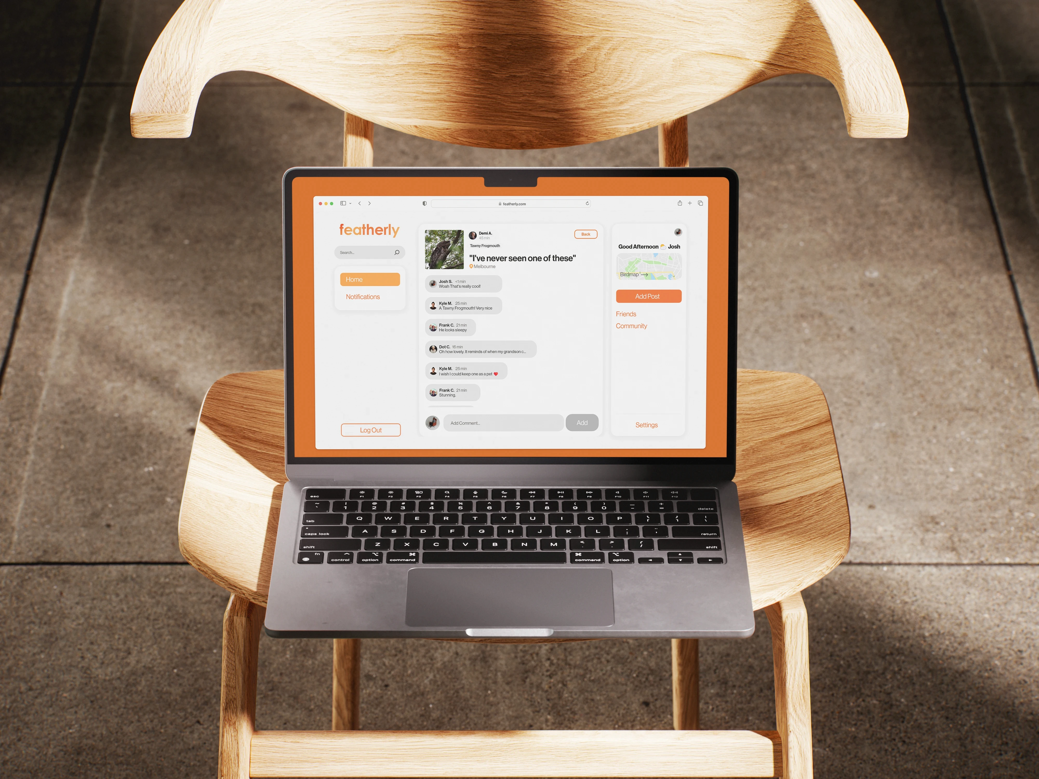
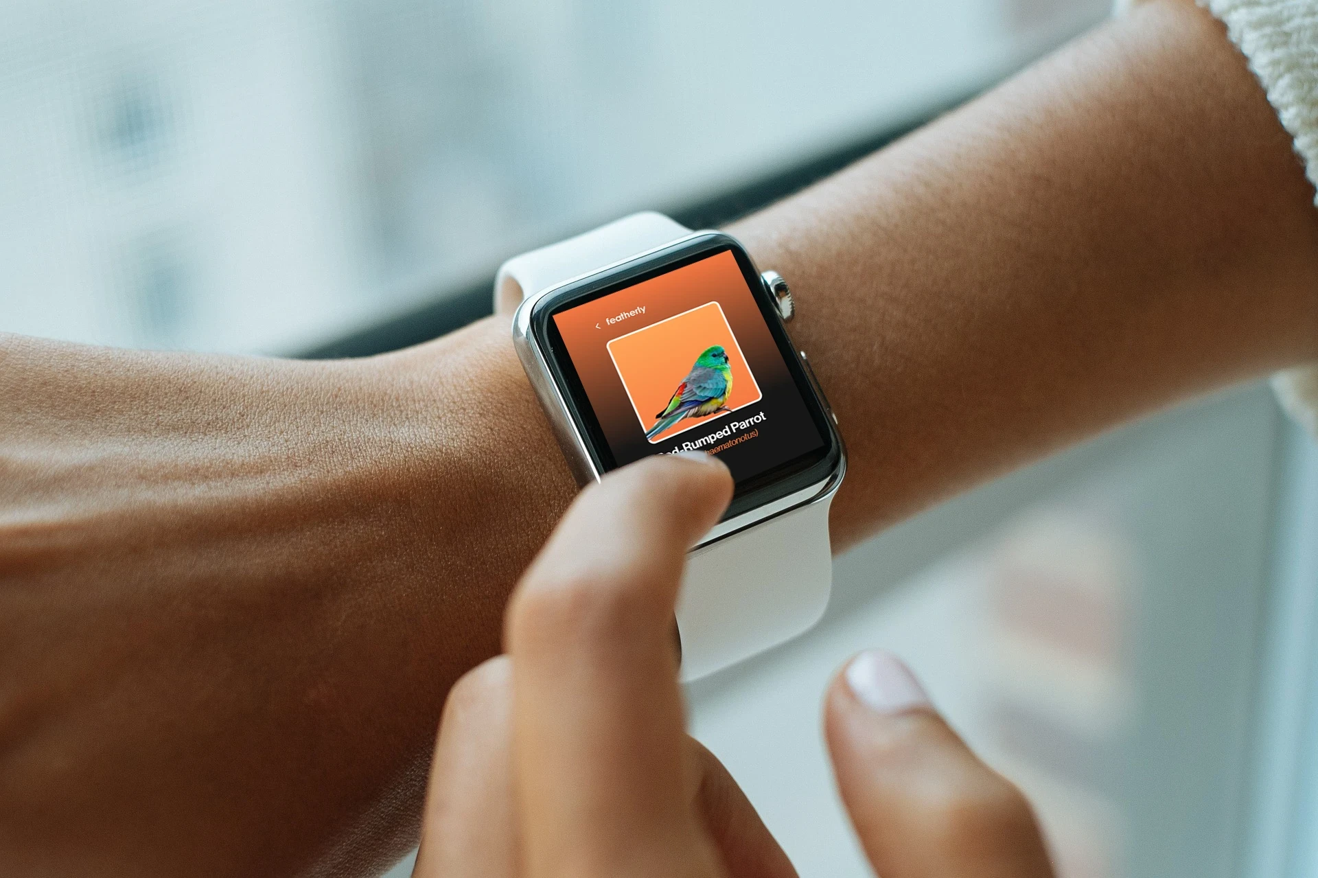
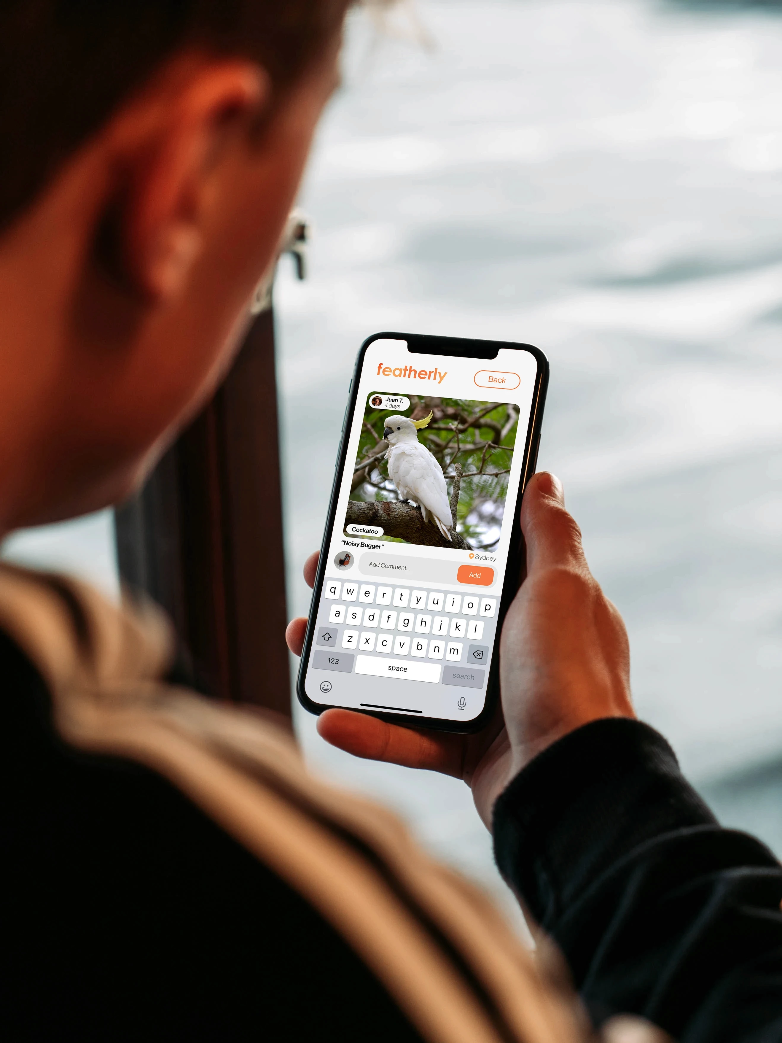
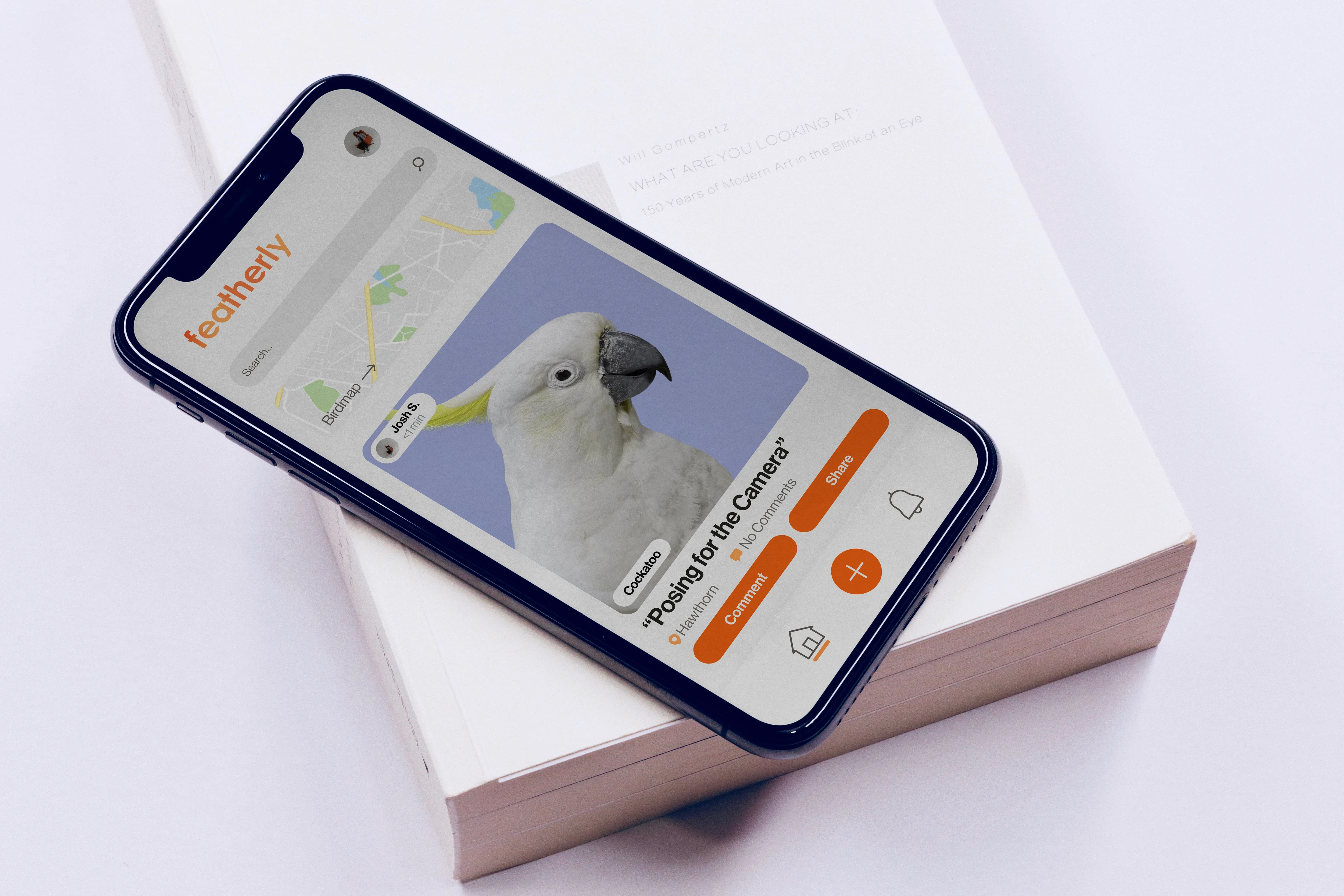
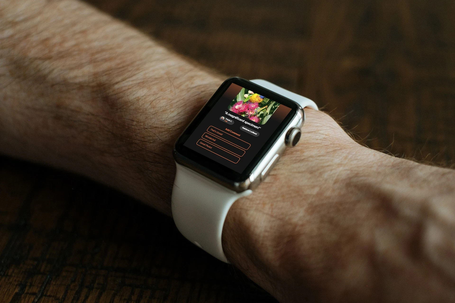
One application… Four platforms…
Upon conducting interviews, an interesting insight came to light: participants used a variety of devices when browsing the internet or using social media, the most common of which was the desktop platform, followed closely by mobile; usage of wearables (apple watch) and IoT devices was also present. As such, it was decided to adapt the application to include these platforms. Whilst functionality differed across platforms (especially across the wearables and IoT platforms), it was important that the experience felt seamless across each platform.
An almost-childproof error prevention
"I'm scared I might make a mistake" and "I don't want to embarrass myself" were often the types of comments that were made in early interviews regarding social media usage among elderly communities. A lack of error prevention methods in existing social media applications felt more like a risk than a method of connecting with people.
In order to increase confidence, a variety of error prevention techniques were explored. The most effective of these were negative affordances and a countdown timer that gave users a brief moment to reconsider their post before it went live.
A slide-to-post interaction was also tested as an error prevention technique (substituting the common post button for a swipe/slide interaction), and while this showed promise, this introduced unnecessary confusion for those who weren't as tech-savvy. Another method introduced a required "I'm ready to post" checkbox, which performed better but felt clunky in comparison to the timer— which gave users the time to feel sure of themselves.


Next Project:
Altor Security
Next Project:
Altor Security
A companion app for a security startup's flagship product.
Ready to make
something great?
Fill out the form to unlock the full potential of your business…
The Idea
This assignment allowed for more creative freedom than others I had done in my time at Swinburne University. I decided to focus this assignment on a demographic I feel is often overlooked: adults aged 50 to 75+. I chose to design a community birdwatching app aimed at promoting social engagement and reducing isolation among older users. The project centred around creating a simple and approachable interface that catered to the needs and habits of this age group.
Challenges
The oldies don't do icons
The biggest revelation from conducting focus groups and time-to-task activities was the common misinterpretation of icons. It's pretty agreed upon by 18–35-year-olds that the paper airplane icon generally means to send or to share, but within the 50-75+ age group the interpretation of iconography varied greatly, often leading to confusion.
To account for this insight, I decided to avoid using icons within the interface, substituting them for text-based buttons instead. The implementation of these new buttons led to a much better understanding and interpretation of the interface, but there was still room for improvement— various affordances were added to the interface to make it clearer what buttons were 'pressable' and when they can be pressed.
Overall, this design decision led to a decrease in the time taken to perform tasks; some participants also noted that they felt more confident using the interface now that the icons had been removed
One application… Four platforms…
Upon conducting interviews, an interesting insight came to light: participants used a variety of devices when browsing the internet or using social media, the most common of which was the desktop platform, followed closely by mobile; usage of wearables (apple watch) and IoT devices was also present. As such, it was decided to adapt the application to include these platforms. Whilst functionality differed across platforms (especially across the wearables and IoT platforms), it was important that the experience felt seamless across each platform.
An almost-childproof error prevention
"I'm scared I might make a mistake" and "I don't want to embarrass myself" were often the types of comments that were made in early interviews regarding social media usage among elderly communities. A lack of error prevention methods in existing social media applications felt more like a risk than a method of connecting with people.
In order to increase confidence, a variety of error prevention techniques were explored. The most effective of these were negative affordances and a countdown timer that gave users a brief moment to reconsider their post before it went live.
A slide-to-post interaction was also tested as an error prevention technique (substituting the common post button for a swipe/slide interaction), and while this showed promise, this introduced unnecessary confusion for those who weren't as tech-savvy. Another method introduced a required "I'm ready to post" checkbox, which performed better but felt clunky in comparison to the timer— which gave users the time to feel sure of themselves.
Next Project:
Altor Security
Next Project:
Altor Security
A companion app for a security startup's flagship product.
Ready to make something great?
Fill out the form to unlock the full potential of your business…